Multidimensional Angular Model (RGB visualization)
Research provenance
This notebook accompanies Multi-sensory Integration in a Quantum-Like Robot Perception Model, published in Experimental Robotics (2021); the preprint is arXiv:2006.16404. Its RGB visualizations are paper-specific and intentionally remain in this notebook.
import matplotlib.pyplot as plt
import numpy as np

from qrobot.bursts import ZeroBurst
from qrobot.models import AngularModel
In this notebook we present a 3-dimensional (\(n=3\)) demo for the
AngularModel class. For simplicity, we consider \(\tau = 1\).
n = 3
tau = 1
Note: The RGB analogy provides an intuitive picture of three normalized sensor channels; it is a visualization device, not a claim that the model learns a color concept.
Input definition
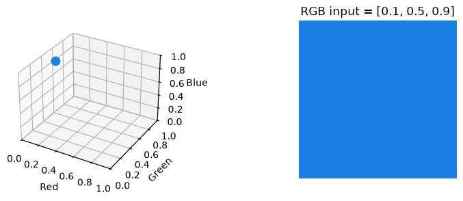
We start by defining an arbitrary normalized three-channel input:
input_data = [0.1, 0.5, 0.9]
plot_rgb_input(input_data)
Encode the input in the model
We initialize the model by instantiating an object with \(n\) and \(\tau\)
model = AngularModel(n, tau)
Encoding a general multidimensional sequence requires one loop over its temporal samples and another over its \(n\) dimensions. This example has \(\tau = 1\), so the single event requires only the dimension loop:
model.clear()  # Keep this cell repeatable by discarding any earlier encoding.

for dim in range(model.n):
    model.encode(input_data[dim], dim)
The model is implemented by a Qiskit quantum circuit:
model.print_circuit()
      ┌──────────┐
q_0: ─┤ Ry(π/10) ├
      ├─────────┬┘
q_1: ─┤ Ry(π/2) ├─
     ┌┴─────────┴┐
q_2: ┤ Ry(9π/10) ├
     └───────────┘
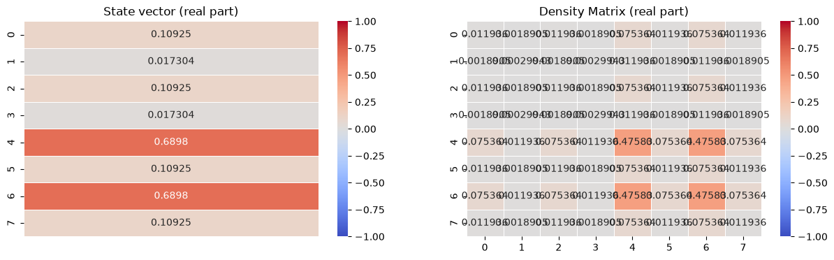
Given the input we defined above, the model is in the following state:
plot_encoded_model_state(model)
Measurement simulation
We simulate shots measurements, and then we extract the relative frequencies for the \(2^n\) possible basis state outcomes:
shots = 1000000
counts = model.measure(shots)
Raw counts for each possible outcome:
import json

print("Aggregated binary outcomes of the circuit:")
print(json.dumps(counts, sort_keys=True, indent=4))
Aggregated binary outcomes of the circuit:
{
    "000": 11986,
    "001": 304,
    "010": 11972,
    "011": 313,
    "100": 475834,
    "101": 11945,
    "110": 475759,
    "111": 11887
}
From the raw counts we can obtain the relative frequencies (aka the probabilities) and compare them with the input sequence. Since we have not operated any change of basis (with the model.query(target) method), the canonical basis is maintained, and it is possible to visualize it still with our RGB representation:
plot_canonical_measurements(input_data, counts, shots)

This shows how the two states which are more likely to be measured are the “blue” \(|100\rangle\) and “cyan” \(|110\rangle\) ones, which are the closes to our “blue-ish” input.
Measurement changes w.r.t. varying input
We can now move the input through RGB space and observe how the probability of each canonical basis state changes. We define this set of inputs:
input_positions = np.linspace(0, 1, 101)
path_positions = np.linspace(0, 1, 6)
path_colors = np.asarray(
    [
        [0.0, 0.0, 0.0],  # black
        [0.2, 0.9, 0.1],  # green-ish
        [1.0, 1.0, 1.0],  # white
        [0.9, 0.2, 0.1],  # red-ish
        [0.2, 0.1, 0.9],  # blue-ish
        [0.0, 0.0, 0.0],  # black
    ]
)
input_colors = np.column_stack(
    [np.interp(input_positions, path_positions, path_colors[:, channel]) for channel in range(3)]
)
plot_input_color_path(input_colors, path_positions)

The color strip renders the input at every position. We now want to see how the probabilities of measuring each of the eight canonical basis states changes with the input. For every point on the input domain, we create a fresh model, encode its three RGB components, and read the exact probability of every basis state from the statevector:
state_labels = [f"{index:03b}" for index in range(8)]
canonical_probabilities = {state: [] for state in state_labels}
state_rgb_colors = {state: tuple(float(bit) for bit in reversed(state)) for state in state_labels}

for input_color in input_colors:
    sliding_model = AngularModel(n=3, tau=1)
    for dim, value in enumerate(input_color):
        sliding_model.encode(value, dim)
    probabilities = np.abs(sliding_model.get_statevector()) ** 2
    for index, state in enumerate(state_labels):
        canonical_probabilities[state].append(probabilities[index])
plot_canonical_input_sweep(input_positions, input_colors, canonical_probabilities, state_rgb_colors)
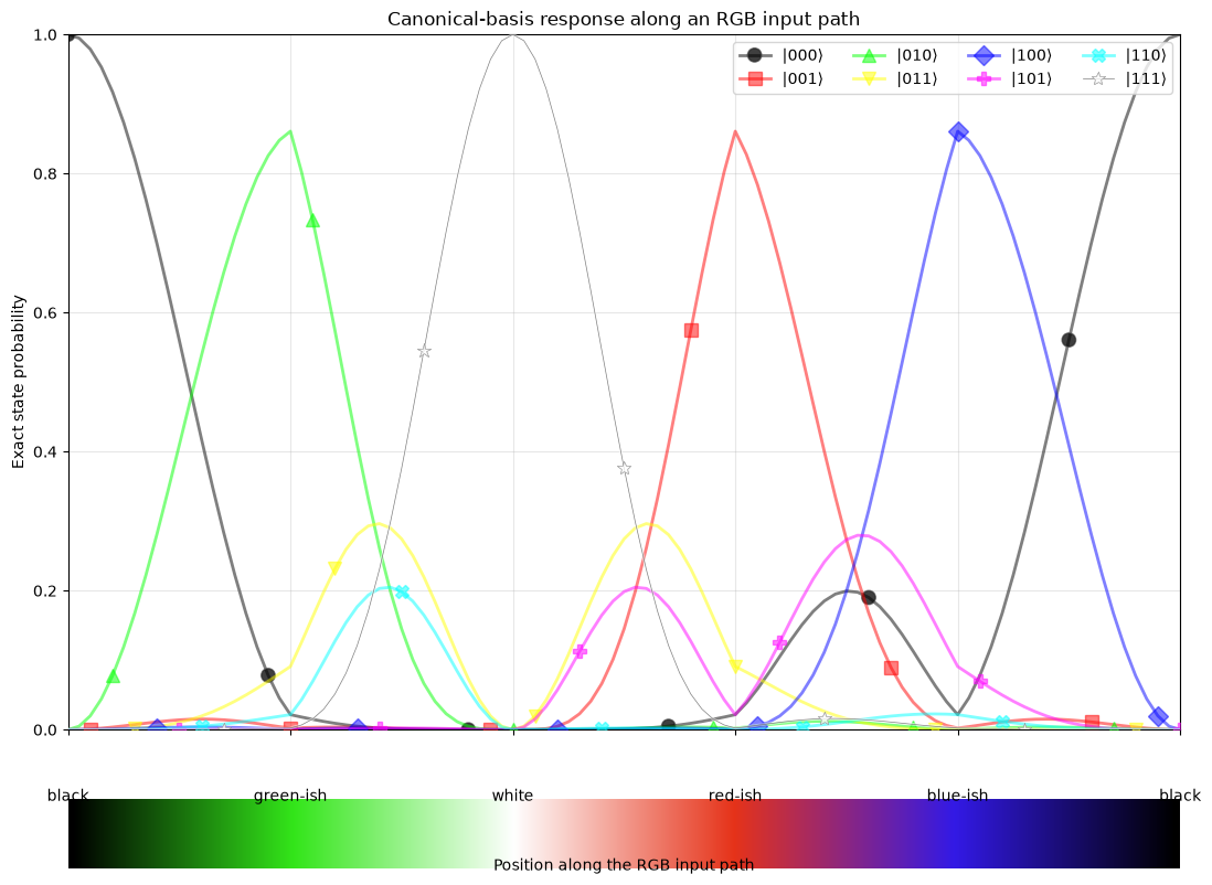
As the input reaches each color stop, probability concentrates on the nearest
canonical RGB corner: \(|000\rangle\) at black, \(|010\rangle\) near green,
\(|111\rangle\) at white, \(|001\rangle\) near red, and \(|100\rangle\) near blue.
Between those stops, several basis states remain probable because each channel
is encoded continuously rather than rounded to 0 or 1. Some curves overlap
when different states receive the same probability; their distinct markers
make those coincident outcomes visible.
Querying for similarity to a color
Now keep a warm-red input fixed and compare it with a blue query:
fixed_input = [0.9, 0.2, 0.1]
fixed_query = [0.2, 0.2, 0.7]
plot_fixed_input_and_query(fixed_input, fixed_query)

A query changes the basis in which the encoded input is measured. Given a normalized target color \(\bar{\mathbf{x}}\), it applies an inverse rotation to every qubit:
This maps an input equal to the query onto \(|000\rangle\). After this basis
change, the state vectors can no longer be mapped to an RGB color. For each channel,
alignment makes the 0 outcome more probable and mismatch makes the 1 outcome more
probable. After measuring a state, ZeroBurst converts its zero-bit fraction
into a match intensity: how closely the sampled outcome matches the query.
OneBurst provides the complementary mismatch intensity: the sampled outcome’s
fraction of bits that differ from the query-mapped zero state.
The next cell encodes a fixed input, applies the query transformation, and samples the queried model:
queried_model = AngularModel(n=3, tau=1)
for dim, value in enumerate(fixed_input):
    queried_model.encode(value, dim)
queried_model.query(fixed_query)

query_shots = 100_000
queried_counts = queried_model.measure(query_shots)
plot_queried_measurements(fixed_query, queried_counts, query_shots)

The tile color now represents “how much the input is similar to my query”
(that is, the ZeroBurst value). With the color code we used here, darker
copper means fewer matching channels, and lighter copper means
more. The probability \(P\) answers “how likely is this pattern?”,
while \(B_0\) answers “what match intensity is emitted if this pattern is
sampled?”
Measurement changes w.r.t. varying query (with fixed input)
We can now hold the same input constant while moving the query through RGB space. First, recall the fixed warm-red input:
plot_varying_query_input(fixed_input)

The query follows a piecewise RGB path from blue to red and then from red to green. Pure red, at the middle of the axis, is the closest point on this path to the warm-red input. The blue and green endpoints each disagree with it strongly in two channels.
query_positions = np.linspace(0, 1, 101)

query_colors = []
for position in query_positions:
    if position <= 0.5:
        blend = 2 * position
        query_colors.append([blend, 0.0, 1.0 - blend])  # blue -> red
    else:
        blend = 2 * (position - 0.5)
        query_colors.append([1.0 - blend, blend, 0.0])  # red -> green

queried_probabilities = {state: [] for state in state_labels}
zero_burst_scores = {state: ZeroBurst()(state) for state in state_labels}
plot_query_color_path(query_colors)

At every position we re-encode the unchanged input in a fresh model, apply the current query color, and record the exact statevector probabilities after the basis change:
for query_color in query_colors:
    queried_model = AngularModel(n=3, tau=1)
    for dim, value in enumerate(fixed_input):
        queried_model.encode(value, dim)
    queried_model.query(query_color)
    probabilities = np.abs(queried_model.get_statevector()) ** 2
    for index, state in enumerate(state_labels):
        queried_probabilities[state].append(probabilities[index])
plot_color_query_sweep(
    query_positions,
    query_colors,
    fixed_input,
    queried_probabilities,
    zero_burst_scores,
)
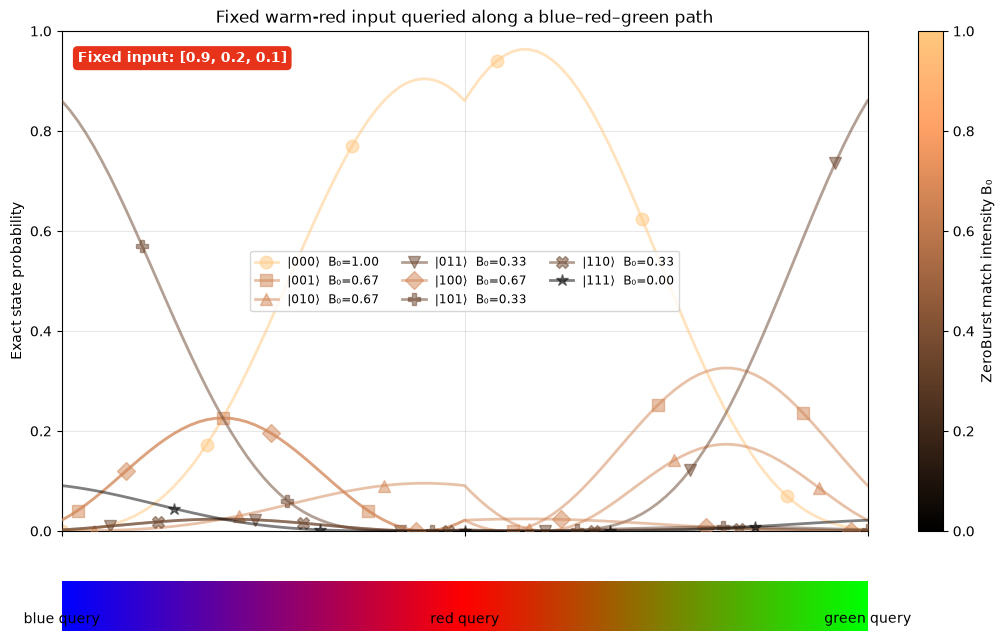
The height of a state curve gives the probability of measuring that state. Its
copper heat color gives the ZeroBurst value emitted if that state is sampled.
The color therefore describes how strongly that particular outcome matches
the query.
Around the red query, states with higher match intensities become more probable. Farther from red, lower-match outcomes become more likely.
We can summarize the complete measurement distribution at every query by
treating each possible ZeroBurst value as a random outcome. The mean is the
average match intensity expected over repeated measurements, while the
standard deviation describes how much individual sampled bursts vary around
that mean:
burst_means = []
burst_standard_deviations = []

for position_index in range(len(query_positions)):
    probabilities = np.asarray(
        [queried_probabilities[state][position_index] for state in state_labels]
    )
    burst_values = np.asarray([zero_burst_scores[state] for state in state_labels])
    mean = np.sum(probabilities * burst_values)
    variance = np.sum(probabilities * (burst_values - mean) ** 2)
    burst_means.append(mean)
    burst_standard_deviations.append(np.sqrt(variance))
plot_burst_summary(
    query_positions,
    query_colors,
    burst_means,
    burst_standard_deviations,
)
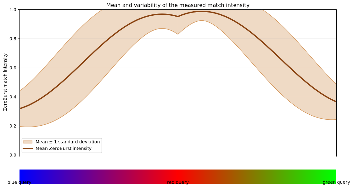
In the plot above, the central line shows the overall output, and the shaded band shows one standard deviation on either side. The values are computed from exact state probabilities, so the band represents intrinsic measurement variability rather than finite-shot sampling noise.
References
D. Lanza, P. Solinas, and F. Mastrogiovanni, Multi-sensory Integration in a Quantum-Like Robot Perception Model, Experimental Robotics, 2021; arXiv:2006.16404.
D. Lanza, Quantum-like Modeling of Cognitive Architectures for Robotics, Zenodo, 2020.